Discover hidden opportunities, streamline your operations, and attract the right clients with our FREE Business Development Audit. 🔍 Spot growth opportunities. 📊 Get expert recommendations. 🚀 Identify the right clients. 🕑 Takes less than 5 minutes
Jewel Enterprise: Building a Unified Brand with Purpose
When Jewel Enterprise approached us, they had already created something rare: a thriving group of businesses across property services, construction, and logistics. Each arm had traction and potential - but their growth had outpaced their identity. Without a central narrative or consistent presentation, they struggled to show up as a serious, scalable group.
They didn’t need reinvention - they needed integration. Our goal was to unify their brand, clarify their structure, and help them present themselves as one professional business, ready for the next stage.
The Challenge
The group was expanding fast, but inconsistently. Each business operated under different logos, tones of voice, and design systems, which caused confusion both internally and externally. Jewel’s leadership recognised that without solidarity, they would never achieve the market recognition or operational clarity required to scale with confidence.
Uncovering the Core
We began by exploring the DNA of each business. Through interviews, workshops, and audits, we uncovered what made them tick. While services differed, there was a common thread: professionalism, reliability, and a drive to do things the right way. This gave us the foundation for a single, unifying brand strategy.
Clarifying the Brand Architecture
To align the group, we introduced a clear brand structure. At the top sat Jewel Enterprise, the parent brand - a mark of trust and consistency. Below it, individual sub-brands like JewelPS (property services) were given space to operate, while drawing identity and credibility from the group.
Unified the brand under one scalable parent company
Positioned sub-brands as distinct yet connected
Built a naming system that supported long-term growth
Designing for Impact and Flexibility
With architecture defined, we created a visual identity that worked across sectors - instantly recognisable, but flexible enough for logistics, property, and construction. Every element was carefully considered to feel confident, modern, and clear.
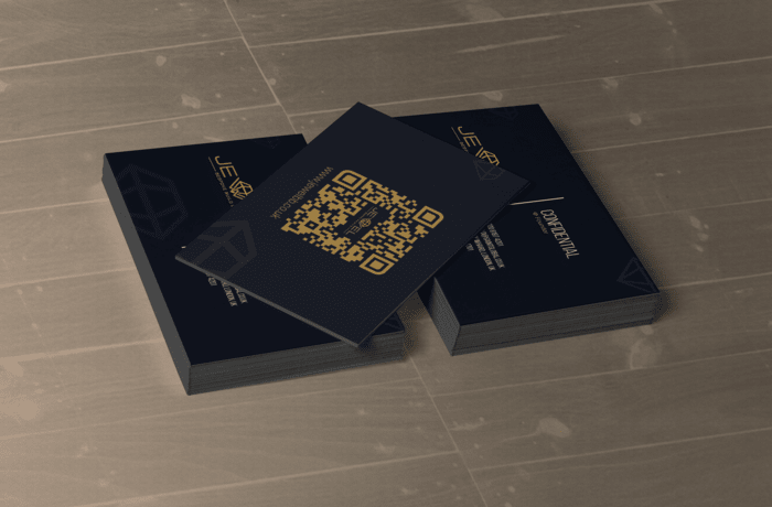
A bold new logo suite adaptable across industries
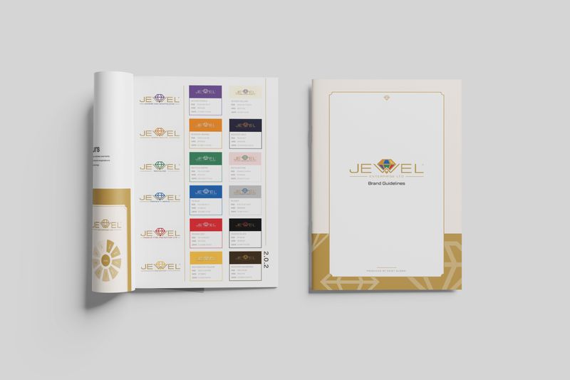
Consistent colour palette and typography system
Visual mockups including uniforms, vans, site boards, and social media
Creating the Brand Playbook
To ensure the new identity stayed consistent across teams and platforms, we developed a detailed brand guidelines document. This acted as a single source of truth - a toolkit that enabled anyone, from designers to directors, to communicate the brand effectively.
Tone of voice guidance for internal and external use
Logo usage rules and hierarchy
Digital and print examples to maintain consistency
Visual styling and application examples
A Website Designed for Clarity and Ease of Use
To bring the unified brand to life online, we created a website that clearly showcases each sub-brand in distinct sections. This thoughtful design makes it easy for users to find the services they need while understanding how each part connects to the whole Jewel Enterprise group. The site’s clean, intuitive layout reflects the professionalism of the brand and supports seamless navigation across diverse offerings.
Clear separation of sub-brands in dedicated website sections
Intuitive navigation tailored for diverse users and sectors
Consistent brand visuals and messaging throughout the site
Enhanced user experience driving engagement and trust
Results
The impact of Jewel’s rebrand was immediate and long-lasting:
Internal alignment: Teams across different business units now operate under one clear vision, with shared language and identity.
Stronger client perception: The new brand presentation reflects the professionalism and scale of the business, opening doors to larger opportunities and more strategic partnerships.
Improved brand recognition: Whether it’s a van on the road or a digital ad online, Jewel now presents as one cohesive group - distinct, recognisable, and credible.
Scalable foundation: With the brand architecture and design system in place, future growth can happen smoothly without compromising consistency.
Conclusion
What began as a branding challenge became a full-scale business transformation. By helping Jewel define who they are as a group, we gave them more than just a new logo - we delivered a strategic framework, a clear identity, and a toolkit for growth.
They now have the structure to scale, the confidence to approach larger clients, and the presence to stand out in competitive markets. Their teams are aligned under one purpose, and every brand touchpoint now reflects the same level of professionalism and ambition.
Jewel has moved from fragmented to future-ready - and with this foundation in place, they’re not just set up to grow. They’re set up to lead. Their story is only just beginning, and the path ahead is bold, cohesive, and full of potential.
Client Testimonial
“Saint helped us turn a group of separate brands into a united enterprise. From branding to guidelines to web, they understood our vision and brought it to life - now our image matches the level of work we deliver every day.”
- Founder, Jewel Enterprise
Ready To Take Action?
"Working with Saint has allowed me to take control of my business and I am thankful that I made that step for myself, my family and my business."